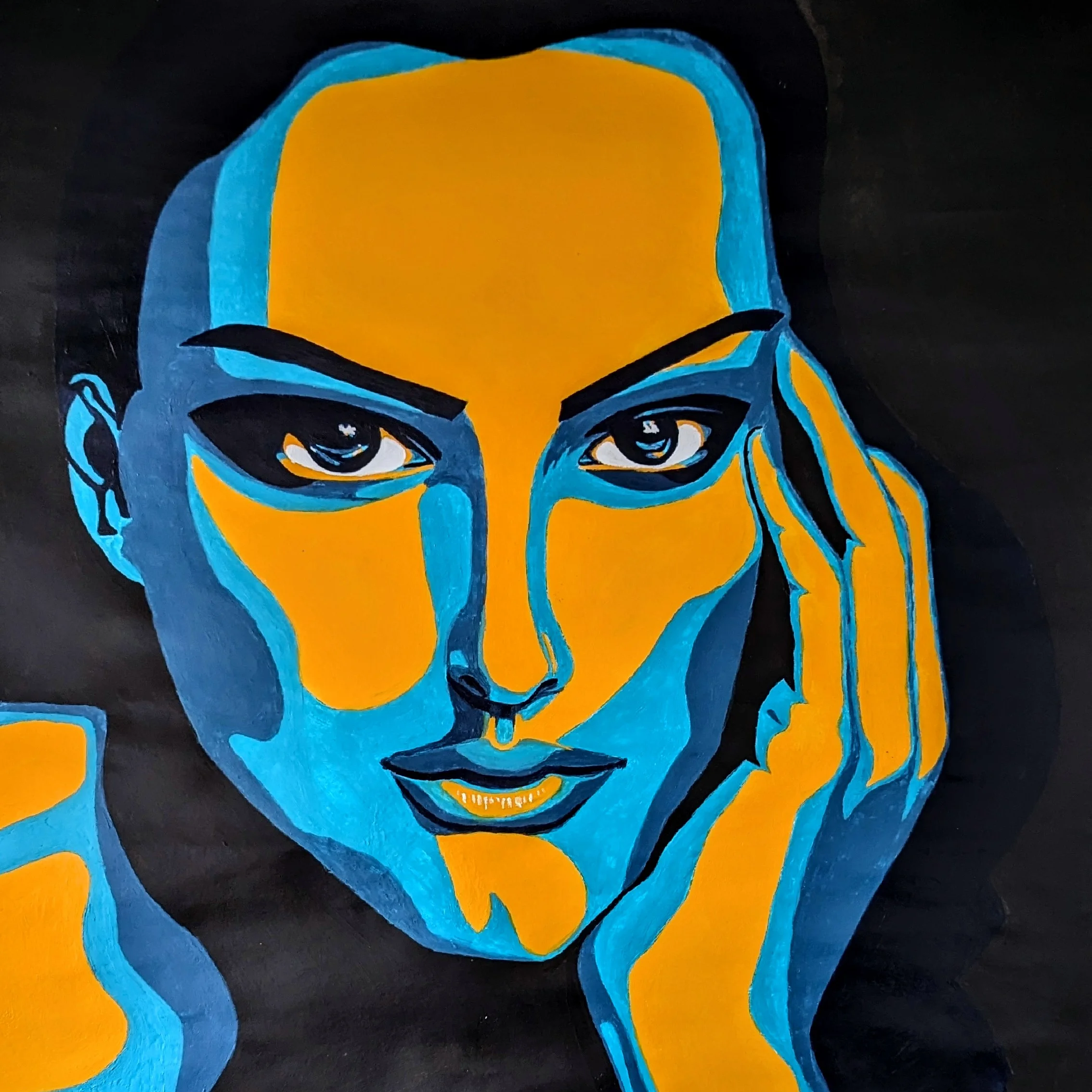
Natalie Portman
Acrylic on Paper
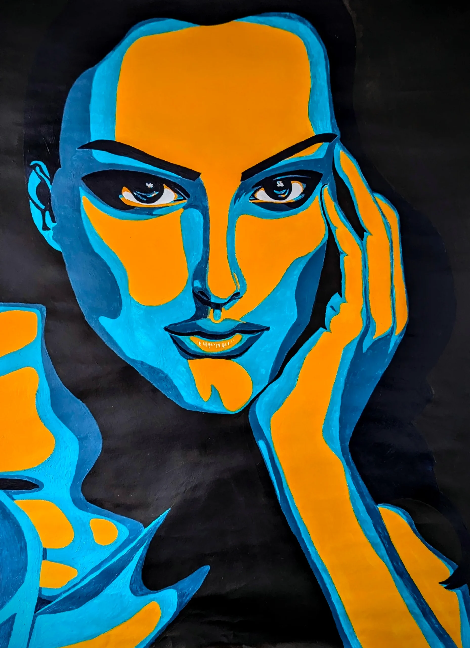
This piece is a portrait of Natalie Portman, painted in acrylic on paper. I’ve always found her features captivating – poised yet sharp, delicate yet strong.
This painting isn’t just about likeness. It’s about structure, tension, and the quiet drama that lives in contrast. Natalie Portman’s face has always fascinated me, not just for its symmetry, but for the way it holds emotion like a secret. This portrait leans into that mystery, using light and shadow as sculptural tools.
* Please note, some links in this post are affiliate links. If you make a purchase using these links I may earn a commission at no additional cost to you. I appreciate your support and it helps me create more great content for you to enjoy!
🧠 Why Natalie?
Some faces invite softness. Natalie’s invites precision.
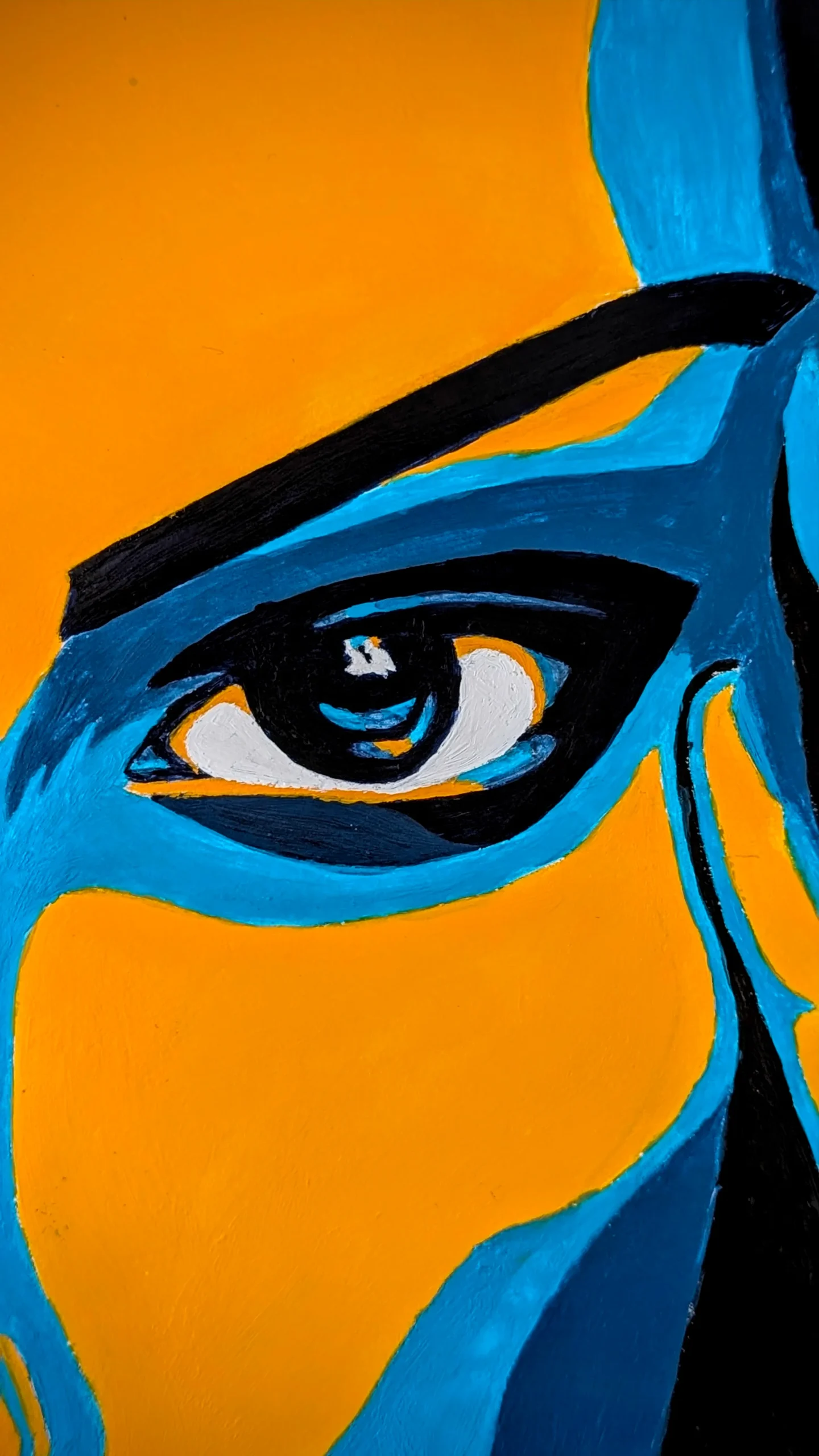
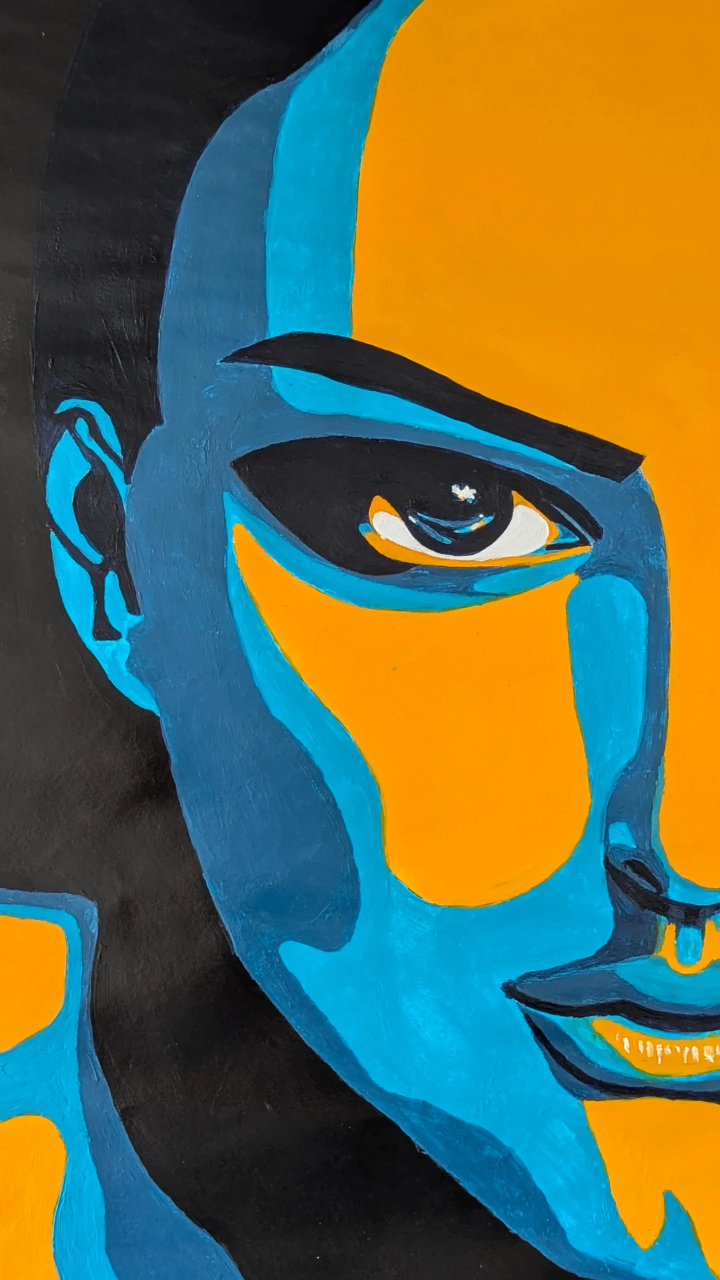
Her features, high cheekbones, angular jawline, and expressive eyes, are architectural. There’s a kind of tension in her gaze, a balance between vulnerability and control. I wanted to explore that visually, not through realism, but through stylised clarity.
This wasn’t about capturing a moment. It was about capturing structure.
🎨 Medium Matters: Acrylic on Paper
Acrylic was the obvious choice. It dries fast, holds pigment, and allows for crisp edges, perfect for a high-contrast approach. I used heavy-body acrylics for their opacity and texture, layering them on hot-press watercolour paper to keep the surface smooth and responsive.
🎨 Recommended materials:
- Liquitex Heavy Body Acrylic Paints – rich, opaque, and great for layering
- Arches Hot Press Watercolour Paper – smooth surface, ideal for crisp acrylic work
🌗 Contrast as Composition
Shadow and light weren’t just tools for realism here; they were the backbone of the composition.
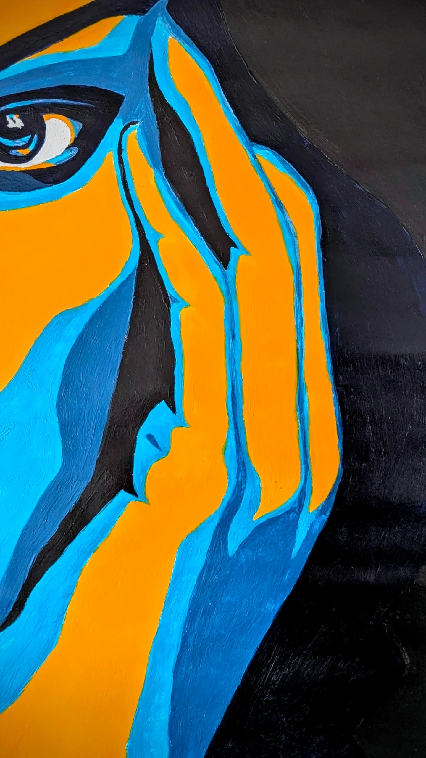
I exaggerated tonal differences to sculpt her face with clarity and precision. The shadows are deep, almost graphic. The highlights are stark, bordering on theatrical. This push and pull creates a sense of volume without relying on soft gradients or blending.
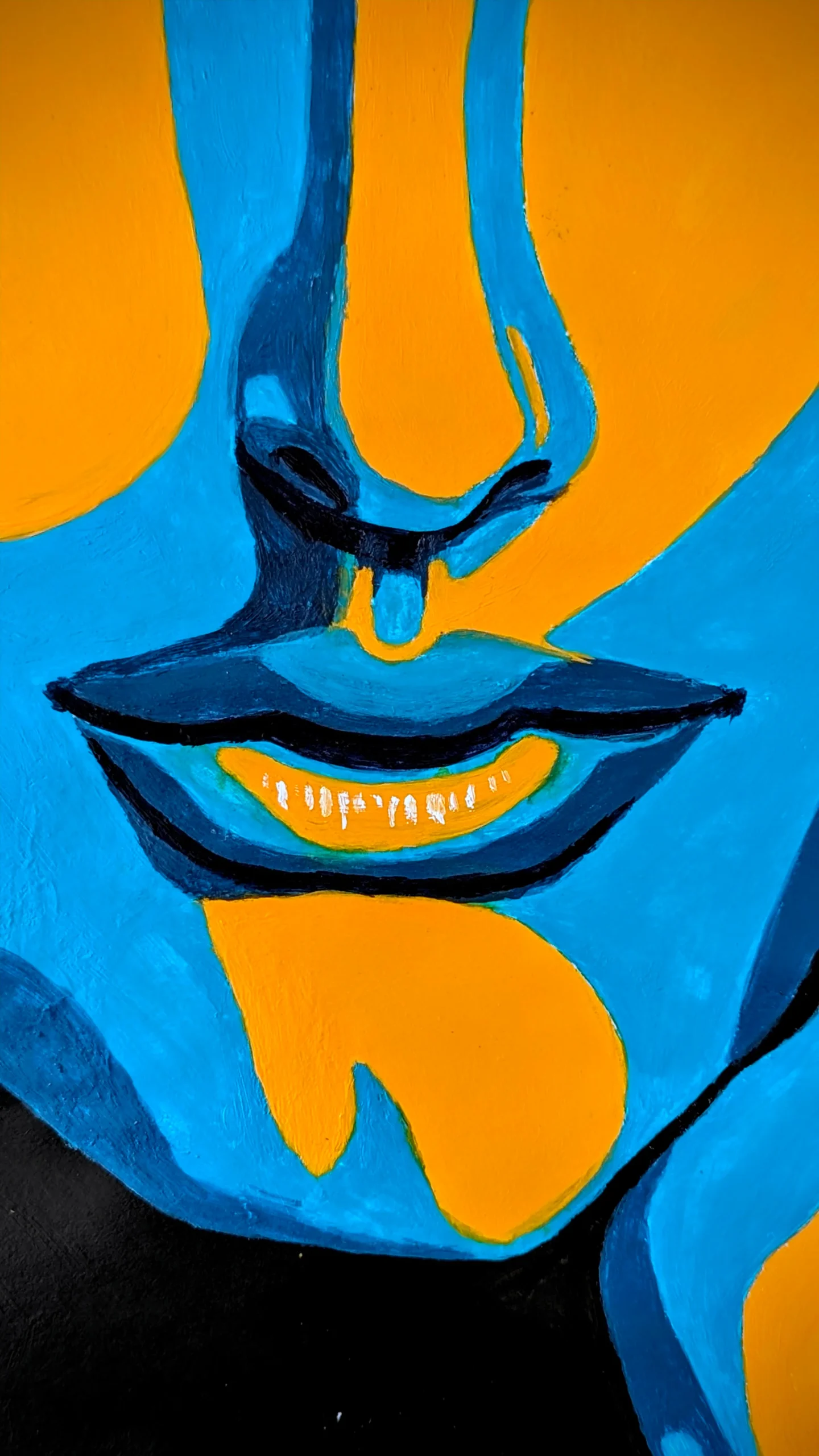
- Dark shadows define the jawline, eye sockets, and neck
- Bright highlights accentuate the cheekbones, nose bridge, and brow
- Midtones are minimal, used only to bridge key transitions
“By exaggerating tonal differences, I aimed to bring her structure to life in a way that felt stylised yet unmistakably true to her.”
🖌️ Process Notes: From Sketch to Final Layer
I started with a loose graphite sketch, focusing on proportion and placement. Once the structure felt solid, I blocked in the darkest shadows using a flat brush and deep shades of blue. From there, I built up the highlights in titanium white and cadmium yellow, letting the contrast do the heavy lifting.
Brushwork was deliberate:
- Flat brushes for clean edges
- Round brushes for subtle transitions
- Liner brushes for detail around the eyes and lips
🖊️ Recommended tools:
- Princeton Acrylic Brush Set – versatile and precise
- Staedtler Mars Lumograph Pencils – great for initial sketching
🎭 Expression Through Structure
Natalie’s expression in this piece is quiet, almost neutral, but the structure carries emotion. The tension in her jaw, the slight lift of her brow, the way her eyes hold space without demanding attention. It’s subtle, but it’s there.
I didn’t want to dramatise her. I wanted to distil her.
This portrait is less about storytelling and more about presence. It’s a study in restraint; letting the composition speak through contrast, not embellishment.
“I wasn’t chasing likeness. I was chasing clarity.”
🧩 Where It Fits: Study, Tribute, and Statement
This painting sits somewhere between a technical study and a quiet tribute. It’s not flashy. It doesn’t shout. But it holds its own; a visual meditation on form, light, and the kind of beauty that doesn’t need explanation.
It’s also a reminder that portraits don’t have to be sentimental. They can be analytical. They can be sculptural. They can be intentional.
"Every shadow was a choice. Every highlight was a boundary.”