What It Means to Be a Colour-Driven Contemporary Artist
When people ask me what kind of artist I am, I often say: “Colour-driven.” It’s not just a stylistic choice, it’s a worldview. Colour is the first language I speak in the studio. Before form, before subject, before meaning, there’s hue, saturation, contrast. It’s how I navigate emotion, tension, and clarity.
Being a colour-driven contemporary artist means letting colour lead the conversation. It’s about trusting that a palette can carry narrative weight, that a single shift from cobalt to vermilion can change the entire mood of a piece.
* Please note, some links in this post are affiliate links. If you make a purchase using these links I may earn a commission at no additional cost to you. I appreciate your support and it helps me create more great content for you to enjoy!
🎨 Why Colour Is My Compass
Colour isn’t just decorative, it’s directive. In my practice, it acts as:
- Emotional anchor: I use high-contrast palettes to evoke urgency, joy, or introspection.
- Compositional glue: Modular systems in my work rely on colour to unify disparate elements.
- Brand identity: My collectors often say they recognize my work by the palette before the signature.
“Colour is the silent voice in every painting - it speaks before the viewer even knows what they’re looking at.”
🖌️ Materials That Let Colour Speak Loudly
To let colour shine, I choose materials that amplify its presence. Here are a few studio staples I swear by:
🎯 Acrylic Paints
I use Golden Heavy Body Acrylics for their rich pigmentation and buttery texture. They hold saturation even when layered thickly.
🧱 Gesso & Primers
A smooth, bright base is essential. Liquitex Professional Gesso gives me the clean slate I need to let colour pop.
🖼️ Canvas & Panels
I prefer Fredrix Gallery Wrap Canvases for their durability and edge presentation – perfect for bold, frameless display.
These tools aren’t just functional, they’re foundational. They allow colour to be the protagonist, not the background.
🧩 Modular Thinking in Colour
My work often involves modular systems – pieces that can be rearranged, recombined, or expanded. Colour is the connective tissue that makes this possible.
- Palette families: I build series around colour families (e.g., citrus tones, jewel tones) to ensure cohesion.
- Contrast logic: Each module balances warm/cool, light/dark, saturated/muted to maintain visual rhythm.
- Collector flexibility: Buyers can mix and match pieces while preserving harmony
“Modularity isn’t just about structure - it’s about freedom. Colour gives that freedom boundaries.”
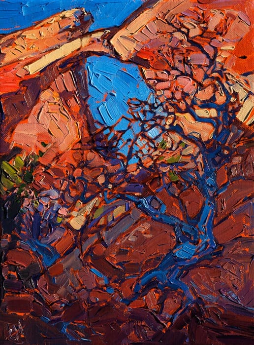
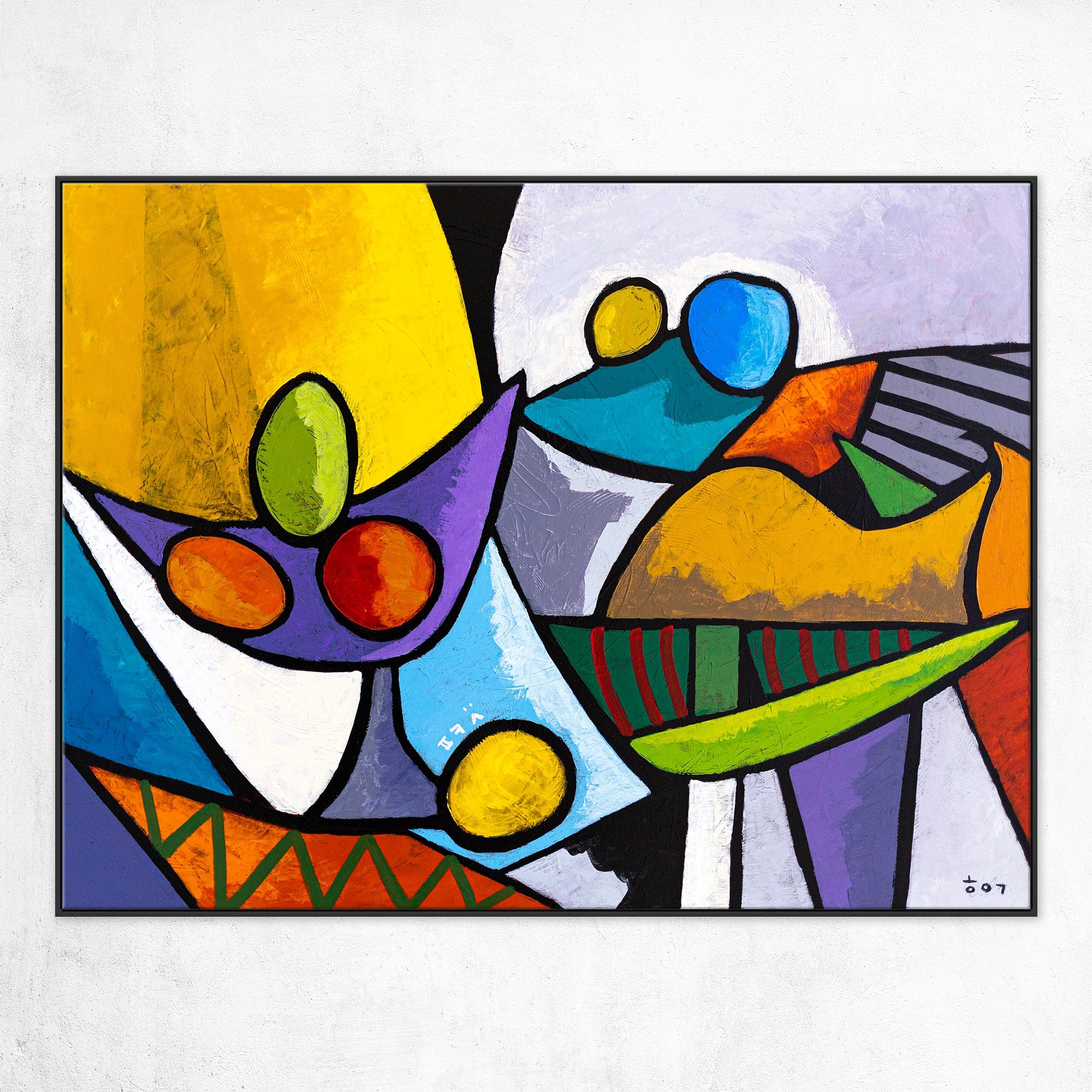
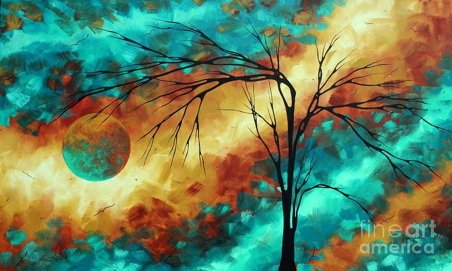
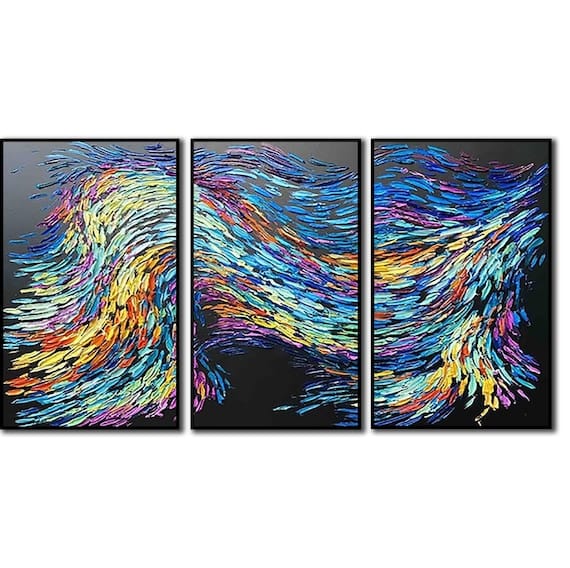
🖼️ Visual Philosophy
Here’s a visual representation of what colour-driven means in practice. These artworks embody the principles discussed above – bold palettes, modular composition, and emotional clarity.
🧠 Emotional Resonance Through Hue
Colour is how I connect with viewers. It’s the emotional handshake before any intellectual engagement.
- Red: urgency, power, confrontation
- Blue: introspection, calm, melancholy
- Yellow: optimism, energy, curiosity
- Black/White: structure, clarity, tension
I often use high-contrast combinations to create emotional friction. That friction invites the viewer to pause, reflect, and feel
“A painting doesn’t need a face to express emotion—it needs the right shade of blue.”
🛍️ For Collectors - Choosing Colour-Driven Work
If you’re drawn to bold, expressive pieces, here’s how to choose artwork that resonates:
- Trust your gut: What colours make you feel something? Start there.
- Consider your space: High-saturation pieces can energize a room; muted tones can soften it.
- Look for clarity: Colour-driven work often has strong compositional logic—trust that structure.
And if you’re curating your own collection, I recommend this colour theory book to deepen your understanding of palette psychology.
🧠 Why This Philosophy Matters
In a world saturated with imagery, colour is still the fastest way to communicate. It bypasses language, culture, and intellect. It’s primal.
Being a colour-driven contemporary artist means:
- Prioritising emotional clarity
- Designing with modularity and usability in mind
- Creating work that invites interaction, not just observation
It’s not just about making things look good – it’s about making people feel something.
🧠 Final Thoughts: Colour as Identity
I don’t just use colour, I live in it. It’s how I structure my day, my studio, my brand. It’s how I connect with collectors, collaborators, and myself.
If you’re an artist, I encourage you to ask: What’s your first language in the studio? If it’s colour, lean into it. Let it lead. Let it speak.
“Colour isn’t just a tool—it’s a philosophy. And for me, it’s the loudest voice in the room.”